Showing posts with label design. Show all posts

Saturday, 6 August 2016

Just My Schtick in a Bag

This time about a year ago (well, tomorrow, technically, but who's counting?), I was carefully sorting through my collection of board games and packing them up to bring them to England with me.

They've served me well here. I've played more this year than ever before, which has been a lot of fun, but all this carting around and handling has taken a heavy toll on the increasing weary-looking resealable baggies I was using to store all my games. I'm loving having the bags, as there's no way that I could take as many games to as many places as I do using the absurdly under-utilised boxes that board games generally come with, but it was becoming clear that if I wanted to keep hold of a reasonable percentage of my game pieces rather than dropping them all over the place, I was going to need some more permanent solutions.

So I ordered a grab-bag of velour off-cuts, and they happened to arrive on my doorstep during a week when I was grappling with a particularly nasty man-cold, so I had nothing better to do with my time than to sit down and make me a bunch of cloth drawstring baggies to house the collection. I started with Dixit, the game that I thought would be easiest since it's just a pack of over-sized cards, and then just kept sewing and found that by the end of the day I'd somehow made seven bags. It was a very tactile and rewarding experience.

I've never sewn before. I've done a bit of cross-stitch during my misspent youth, but that's about it, so I wasn't sure that I'd manage to create anything remotely strong or attractive enough to do the job, but it seems like it's pretty hard to go wrong with sewing as long as you tie enough knots and don't get bored easily. I'm not going to be winning any award for my stitching, but it seems to do the job so far. Spurred on by my success, I thought it might be fun to make a little tutorial for anyone else who wants to replace their boxes and join the game bag revolution.


I need to make a bag for 7 Wonders, as the baggie for the cards split last night and the one for the tokens is heading the same way. The most important thing is selecting a decent colour of velour for the game from amongst my admittedly limited selection (hey, it was cheap!). I've decided to go for this nice rich red colour, because it just screams ancient riches and worldly power, but mostly because I haven't used red yet and it looks like there might be just about enough of it.


Cut the fabric to size, leaving room on each edge (and particularly the top) for the stitching. I'm terrible at estimating how big I need to make the bags, but as long as I tend a little on the generous side it seems to work okay. I don't worry too much about cutting straight or square or anything like that. What do you think this is, a sewing blog or something?
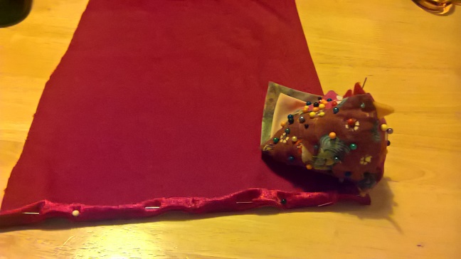

On the backside of the fabric, fold the edges of in about a centimeter and pin them using the pins from your handy pin chicken. The pin chicken bit is very important. Velour doesn't fold very well, but pins are magical things, so I'm sure you can make this work. Remember that pins are for fabric and for chickens, but not for Thomly fingers, I forget that bit far too much. Sew down the side about half-way into the fold, as you need to leave enough room between your stitching and the edge of the fabric to put stitch another row later on if you want you baggie to look nice. You can actually skip this whole 'sewing down the sides' thing if you want to, I have done so on about half my bags so far, but this'll make it look a little nicer and be a lot stronger, so it's probably worth the extra effort, and sewing is surprisingly cathartic, so why exactly would you want to do less of it?


Next off, you fold the top over about 2.5 centimeters, and then back in under itself for about 1 centimeter and pin it in place. When you sew this, you're going to create a nice loop for the drawstring, and you'll be going through the fabric three times to put strength into the seam that's going to be under the most stress when the bag is in use. Since I'm rubbish at pushing the drawstring through without tweezers and my tweezers are in India at the moment, I sewed this bag with the string already in place (if you're going to do this, make sure you don't sew it in, it needs free movement. Go ahead and sew that sucker. If you can, you should try and use a thread that's a good colour to be camouflaged on your fabric, but I only have three colours of thread and none of them are red (what do you think I am, some kind of sewing person?), but this purple one seems to work even better than I'd hoped.


Now you fold your bag over (still inside-out) and sew the sides together, staying more towards the inside of the bag than the other stitch you put in the edges earlier, so that once you turn the bag the right way out all the stitching will be hidden inside (it's the professional touches that show you care). Make sure not to sew up the loop at the top where the string goes, otherwise you've just put a whole lot of effort into sewing up that top bit for no reason at all, and you'll feel a bit silly. Then you sew the bottom too. If you were going to make it nice you'd probably use a new piece of thread for this, but since I always hugely overestimate the amount of thread I need for the sides I generally have a bunch left over and just continue along the bottom as well. Not saying you should, just saying it's an option, m'kay? I mean, another option is sewing with a machine, but I don't think I'm going to be fitting one of them in my luggage allowance any time soon, and I don't think I'd know what to do with one if I had it anyway, so hand-sewing and cutting corners as desired will just have to work for me.


Turn your bag inside-out, and viola! I bought some little stopper thingos to seal the bags up, though you could tie knots in your drawstring if you prefer. These things are pretty fun (apart from threading them, grr!), so it's totally worth getting them, though, especially as they're dirt cheap. Now I have a nice little baggie to keep my copy of 7 Wonders in, a little oversized, but pretty much right, and at least this way I have a little room if I ever decide to invest in another expansion. All I have to do now is make another bag for the boards sometime.


This one goes well with the rest of the collection, and I'm really happy with how it worked out.

Here's wishing you a little spark of creativity, whatever it is you find yourself doing today.

Blaugust writing prompts:
1) What skills or abilities do you have that most people would never suspect?

2) What tasks have you set out to do that you found surprisingly enjoyable?
3) What do you own that could really do with more efficient storage?

Friday, 21 August 2015

Blaugust 21/31: Scheming Spires

It's still Blaugust, guys. This is day 21 of 31...

It seems like a bit of an anticlimax to have got to the Friday after the two big long posts about ties (voting is still open on the ties!) and games the last two weeks and just have a few bits and bobs to share, but maybe that's a little metaphor for moving countries. We do the big things, and they feel good, but it's all the little things mounting up that end up getting the better of you.


To try and keep track of all these tasks, Mrs. Owl and I are trying out using Trello. I've used it a little for myself for various projects, but this is the first time that I've tried to use it in a team environment. I like Trello for the way that it allows and encourages you to use their simple idea for all sorts of different things, instead of boxing you into one idea, so I look forward to seeing how it goes.

So far, we have about a hundred items on there, but by separating the tasks between us each week and setting some goals, maybe we'll knock at least enough of these items off that by the time we fly the country in a month we'll have at least fulfilled all of our legal and financial requirements.


Some of the items on my list this week are going pretty well. I've made a good show of cleaning out the shed where we'll be storing all the furniture that we haven't found a home for. The next thing that we have to do here is actually decide how we want to store things in here before we move too many more of them, as some kind of sensible system is going to be needed if the shed isn't just going to become a smaller, colder version of the pigsty that our house can become on a slow housework week. We haven't decided if we're going to stack things this way, or that way, and leave a corridor against the wall, or down the middle...and of course, we're not quite sure what we're putting in there, as we'd like to be able to sell or give away some of the furniture, etc. That's probably fuel for another post some night when I'm feeling more organised.


You may have noticed that there was a bed up against the wall in the shed there. That's because one of the other items on our list has been to clear out our bedroom for use as a space to pack and organise, and also eventually as a second area for people in the occasion of us having some kind of going away party. So far...this hasn't really worked out. We got the bed out, and did some vacuuming that we've been putting off for years, but then we moved our desks down from upstairs. It's turned into a kind of quasi office for everything from dressmaking to CounterStrike, and the actually using it to do packing in is more of a potential thing than something that seems likely to happen in the near future. We're sleeping upstairs in the front room from this point, but it's still strange to walk into the room that we've lived in for the last three years and find it so empty.


So, there's a couple of things that have been qualified successes so far, but there's one thing that hasn't gone that well, and that's the applications for visas. It's been difficult to even get to this point what with all the hoops that have needed to be jumped through, but now that we're here, we find this dread notice up on the visa site...it's in beta. Let me tell you, if this is an improvement, the old system must have been an abomination unto Nuggan. I don't want to complain too much given that I want the nice fellows at the foreign office to let me into the UK, but there's a couple of things that I'd have thought would be part of a modern web-based system of this nature:

  1. Integrate the help documents (if they exist), so that all applicable definitions and requirements can be looked up in-line rather than having to refer to all the separate requirements documents (if you can find them)
  2. Use some kind of validation checking, so that text cannot be entered into fields where numeric results are expected, at least
  3. Indent or distinguish in some way between parent/child questions so that the user can determine which questions relate to each other
  4. Check your grammar ("Enter your the maintenance charges") and keep continuous formats for questions.
  5. Don't repeat the same questions.
  6. Provide information you already know about the user, calculate what you can and fill in any requirements rather than asking the user to have a perfect understanding of the eccentricities of your system.
  7. If you're running a beta, provide a feedback form so that the users you've shanghied into using your new untested system can actually give you some feedback on it.
So, Visas aren't going great. But they're a walk in the park considering some of the other nonsense that we're wading through at the moment. Don't even get me started on the bloody Oxford Real estate market...nevertheless, hope springs eternal, so here we go again...


Thursday, 13 August 2015

Blaugust 13/31: Vexillologists of the World Rejoice!

This is part 13 of 31 in my effort to corrupt Blaugust with a touch of the Leaflocker madness.

If you're hip with the vexillological news, or you've noticed me being a wag about it on twitter of late, then you'll know that our antipodean neighbours, New Zealand, are in the process of narrowing down a field of 10,292(!) proposed flags to 4, in order to hold a series of referenda about replacing their current National Flag with a brand-spanking new one. This is of great interest to me not only because I'm a sucker for a good flag, but also because the NZ flag is quite similar to our own, and changes to their flag will certainly reignite the debate here about updating the national banner.

The issues facing our flags are similar. They both fly the Union Jack in canton, and these days we treasure our independence from the Mother Country, so they look pretty dated. To the indigenous groups of both countries, these flags represent a long history the subjugation and repression at the hands of white settlers and governments. And of course, people keep confusing the two with each other. There's a lot of support for the current flags too, especially amongst veterans groups, so it won't be an easy process, but nevertheless, NZ is going down the path of selecting a candidate and running a public vote.

An independent panel has been made responsible to setting the criteria for a flag based on the values of the people of New Zealand. This process produced some handy statements: "A great flag should be distinctive and so simple it can be drawn by a child from memory. A great flag is timeless and communicates swiftly and potently the essence of the country it represents. A flag should carry sufficient dignity to be appropriate for all situations in which New Zealanders might be represented. It should speak to all Kiwis. Our hope is that New Zealanders will see themselves reflected in these flags’ symbols, colour and stories." and "The message was clear, and the Panel agreed. A potential new flag should unmistakably be from New Zealand and celebrate us as a progressive, inclusive nation that is connected to its environment, and has a sense of its past and a vision for its future."

As an Australian, I might have some difficulty judging what speaks to New Zealanders, but from those statements, here's a list of criteria that I think you can actually just a flag on:

1) Symbolic - The symbols and colours used should be meaningful.
2) Identifiable -  It should scream New Zealand.
3) Inclusive - It shouldn't use exclusively either British or Maori symbols.
4) Distinctive - It can't look like any other national flag.
5) Simple - It must pass the Betsy Ross test.
6) Timeless - It shouldn't feature the 2015 All-Blacks.
7) Dignified - It shouldn't look like a brand, and should be attractive in and of itself.

Of these, most are pretty self-explanatory, but I thought we'd dwell on the symbols for a moment. The symbols that I recognise as representative of NZ are:

1) The Southern Cross - Yeah, NZ is in the South. This recognises their colonial past without being the Union Jack itself. The NZ cross has only four stars, unlike the Australian one which has five.
2) The Koru - A symbol from Maori art, the Koru (a fern bud) represents life, peace and strength and the Maori people generally. It may be opposed by non-Maori conservatives.
3) The Silver Fern - The fern (generally silver on black) is used by NZ sporting teams, and widely recognised as a symbol of NZ and its environment and a compromise between the Koru and the cross.

4) Red/White/Black - These are NZ's long-standing official colours. They're represented on the nations awards, and in the Tino Rangatiratanga, the country's generally-accepted Maori flag.
5) Red/White/Blue - Colours on the current flag.

Added bonus: For all you stats nerds out there, the panel has helpfully produced these graphs and tables detailing the usage of these and other ideas in the 10,292 proposed flags. Which is most awesome, in this stats nerd's opinion.

The expert panel has whittled these 10,000 entries to 40, which have been roundly panned by everybody, of course. All that remains now is for us to turn our unschooled, culturally insensitive eye to the 40 flags on the long-list and make our calls. I hope you'll disagree vehemently with my choices and that we'll have it out in the comments section. I'm going to attempt to rate with reference to the above criteria, but let my gut drive the overall numbers, as always.


Black & White Fern
7. This is very familiar to us as similar to the straight silver fern on black used by many NZ sporting teams. But more complex and thus less attractive. If people don't want to use the sporting flag then they won't want this.


Koru (Black)
7. Attractive and simple, but I don't think there's enough here to make it look like a flag instead of a corporate symbol. I also think the Koru by itself won't win out with non-Maori voters.


NZ One
5. I think this is a less attractive, less 'flaggy' version of the previous flag.


Tukutuku
5. It's distinctive with its weaving motif, but the colours don't really work and it doesn't feel like a flag one could go to war under.


Fern (Green, Black & White)
6. See comments on the first fern, except that the colours aren't very attractive.


Inclusive
5. It's unattractive design-wise, feels too unbalanced.


Raranga
7. For me, this is a much sexier version of Tukutuku above. The designer's gone with a weaving motif rather than a more common one, but it combines Maori and Western culture in one distinctive design. I don't know that it shouts NZ, and I'd make the Southern Cross bigger, but this is my favourite so far.


Unity Koru (Red & Blue)
4. I don't like this at all. It's not recognisably a Koru to me, so it doesn't say NZ. And this colour scheme and division had ben hijacked by the NBA too much for it to not feel like a brand. Symbolic, but not the flag for me.


The Seven Stars of Matariki
6. Hrmm... a Southern Cross that feels distinctly New Zealand when compared to other constellations, but I don't think a constellation by itself is enough to identify a nation. I like it, but I'd like it a lot more if there was a nod to history and the stars were coloured-in red like the current flag.


Curly Koru
7. See, this is nice, there's a nod to history in the colours but it's dominated by the Koru, but the NBA problem rears its ugly head again. I suspect that this will be a common problem, and this copes better than any of the other examples I've seen.


White & Black Fern
7. See "Black & White Fern". I think this one is very slightly superior.


Silver Fern (Black & Silver)
4. Yuck Yuck Yuck. Take a good symbol and make it look bad.


New Southern Cross
4. One for the traditionalists, there's not any nod to the indigenous culture here, and it's just really boring.


Silver Fern (Black,White & Blue)
6. Aswap-out of the Union Jack for the silver fern. I don't think it's timeless, as aesthetically it would be better if they chose either black or blue, but this will be popular.


Unity Fern (Red & Blue)
7. I really like this. Largely white flags look a little strange, though.


Manawa (Black & Green)
8. See, I don't get the fascination with green. This is a really, really sexy modern design, but it would be so much better with red. Maybe that would be TOO Maori, though, so maybe swap the black with blue as well.


Land Of The Long White Cloud (Traditional Blue)
6. I like the balance, but the swipe feels too much like a Nike swoosh to me.


Silver Fern (Black,White & Red)
10. Yes. This should be the new flag, you Kiwi dudes. History, native culture, identifiability, design. This is it!


Black Jack
8. When I first saw this, I threw it out immediately as too British, and I still think it is, but I also really admire the effort to merge the Maori culture into the current flag rather than elements of the current flag into a new symbol. Those Koru's as part of the Jack, they are amazing. I could live with this being my flag.


Land Of The Long White Cloud (Ocean Blue)
5. Too 'Pacific Island' for me. Yes, I know where NZ is, but you know what I mean.


Southern Cross Horizon
6. Clever. But too corporate. More boring than the world's most boring flags.


Silver Fern (Red, White & Blue)
7. I suspect this is more popular than the black version, but it just shouldn't be. It has NBA problems again, and we all associate black with NZ so much more than blue.


Koru and Stars
6. See, I like the idea of this better than the version with the fern, but the execution is just not as good.


Silver Fern (Black & White)
9. This is widely used already and very popular. I don't think it's as good at the black and red version, but it has history on its side and if people can get over the fact that in the past it's mostly been used for sport, this will win. People that think it's like the ISIS flag are a little misguided.


Southern Koru
5. See, this is really similar to the Manawa one that I love, but this doesn't work for me. I think it's the white. Lots of white on flags just looks weird.


Silver Fern (Black with Red Stars)
7. Either pick the plain silver fern or do something a little more different. This is boring.


Moving Forward
5. This is ugly design-wise. As I now that I've seen the Manawa flags I can't prefer a Koru flag to them.


Huihui/Together
5. Old world countries have tricolours. We should leave them well alone. Looks like a school logo or similar.


Wa kainga/Home
4. This is probably very symbolic and all, but it doesn't say anything to me.


Silver Fern (Green) 
7. I just don't get the green thing. NZ is a very green country, don't get me wrong, but it's just a colour I don't associate with their flags.


Embrace (Red & Blue) 
7. I really like this combination treatment of the fern and koru. It seems so intuitive and totally works. This one has NBA problems, but if it were in black...maybe a little too Papua New Guinea?


New Zealand Matariki
7. I like the green thing on this. That's clearly the land under the long white cloud, and there's the sky. I really like this design, but I don't think it works when hanging vertically, which I think is an important element.


Unity Koru
7. This is really well balanced. So well balanced that I think people will struggle to tell it apart from France.


Finding Unity in Community
7. I like the asymettry of this one, but the blue and black thing still doesn't work for me. It feels very New Zealand, but I can't see it beating some of the other candidates with similar themes.


Koru Fin
6. It's not this flag's fault, but I'm over Koru and stars motifs now. This one doesn't speak to me.


Koru (Blue)
6. Sister to Koru (Black) but with an inferior palette.


Manawa (Blue & Green) 
7. This isn't as nice as the other Manawa design. It's...just kinda weird.


Red Peak
4. Nope.


Pikopiko
5. The colours remind me a lot of my time in New Zealand, but they're just not... flaggy.


Modern Hundertwasser
8. This is actually really good. It feels like a flag. If it were red it would have scraped into the top four.


The TL:DR version?


The New Zealanders should pick between these four flags, but decide on the last one to duke it out with the current flag.

Good luck with the choices, my New Zealand brethren, and congratulations for having the debate. You're so far ahead of us in so many ways that if you're not careful all the Australians are going to move over there.